Customization options — SD-06
Summary
keep the skewed bars, drop the 02/03 numbers data-splux-title="rb" -> do not force uppercase on the L2 heading 5. The numbering opens at 02 (02, 03, 04 ...). Change the trailing value of `counter-reset: splux-step 1` in the CSS below to shift the whole run. 6. The counter increments on the HEAD ROW (`.tpo_option-group_wrapper > .tpo_option-label-container`), not on the group wrapper. A group whose head row is `display:none` - how the app suppresses a branch's title - must not consume a number, otherwise the visible run skips one (2026-09-18: the `Your Design` finish group used to eat 02). Keep the increment and the `::after` that draws the number on the same element. WHY THIS IS CSS-ONLY --------------------------------------------------------------------------- - Easify injects this block with `container.innerHTML = content`. Scripts inserted that way are inert (HTML spec: "already started" = never started), so a tag here would silently do nothing. Do not add one. - The group disclosure state is already exposed by the app as the `.show` class on `.tpo_option-group_wrapper`, so no JS is needed to know which step is open. - ::before/::after cannot lay out the right-hand side here: the chevron is a real inline sibling positioned by the app's own `.tpo_option-group_wrapper > div > svg { margin-left: auto }`, and the head row is display:flex. So the rail is drawn with pseudo-elements on the head row (bars, number) while the chevron keeps its natural place. SCOPE PREFIX --------------------------------------------------------------------------- Every rule is prefixed with .tpo_option-set-wrapper:has(.splux-optgroup-scope) so the styles cannot leak into option sets that do not opt in, and so they outrank the app's own stylesheet. Do not shorten it. --> /* ========================================================================== Marker and spacing ========================================================================== */ .splux-optgroup-scope { display: none; } .tpo_option-set-wrapper:has(.splux-optgroup-scope) .tpo_option-html:has(> .splux-optgroup-scope), .tpo_option-set-wrapper:has(.splux-optgroup-scope) .tpo_option-container:has( > .tpo_option-html > .splux-optgroup-scope ) { margin-bottom: 0; } .tpo_option-set-wrapper:has(.splux-optgroup-scope) .tpo_option-container:has( > .tpo_option-group_wrapper ) { margin-bottom: 0; } /* ========================================================================== Step numbering ========================================================================== */ .tpo_option-set-wrapper:has(.splux-optgroup-scope) { counter-reset: splux-step 1; } .tpo_option-set-wrapper:has(.splux-optgroup-scope) .tpo_option-group_wrapper > .tpo_option-label-container { /* The number is drawn by this same head row's ::after. Incrementing here (rather than on the group wrapper) keeps the two on one element: a group whose head row is display:none - which is how the app suppresses a branch's title - no longer consumes a number, so the visible run stays gapless. See docs note on step numbering. */ counter-increment: splux-step; } /* ========================================================================== L1 Header Row ========================================================================== */ .tpo_option-set-wrapper:has(.splux-optgroup-scope) .tpo_option-group_wrapper > .tpo_option-label-container { display: flex; align-items: center; gap: var(--splux-space-1); min-height: var(--splux-hit-area-min); margin-bottom: 0; padding-top: var(--splux-space-3); padding-right: 0; padding-bottom: var(--splux-space-3); /* Keeps the skewed accent bars fully inside the gradient surface. */ padding-left: 12px; background: var(--splux-gradient-title-fade); border-bottom: var(--splux-divider-width) solid var(--splux-divider-color-light); transition: border-color var(--splux-duration-fast) var(--splux-ease-out); } /* ========================================================================== Expanded Header ========================================================================== */ .tpo_option-set-wrapper:has(.splux-optgroup-scope) .tpo_option-group_wrapper.show > .tpo_option-label-container { border-bottom: 2px solid var(--splux-color-primary-black); } /* ========================================================================== First Accent Bar ========================================================================== */ .tpo_option-set-wrapper:has(.splux-optgroup-scope) .tpo_option-group_wrapper > .tpo_option-label-container::before { content: ""; order: -2; flex: none; width: 4px; height: 16px; background: var(--splux-color-primary-white); transform: skewX(-20deg); } /* ========================================================================== Step Number ========================================================================== */ .tpo_option-set-wrapper:has(.splux-optgroup-scope) .tpo_option-group_wrapper > .tpo_option-label-container::after { content: counter( splux-step, decimal-leading-zero ); order: -1; flex: none; font-family: var(--splux-font-family-en-body); font-size: var(--splux-font-size-caption); line-height: 1; font-weight: var(--splux-font-weight-h3); letter-spacing: var(--splux-letter-spacing-caps); font-variant-numeric: tabular-nums; color: var(--splux-color-text-white); } /* ========================================================================== L1 Title ========================================================================== */ .tpo_option-set-wrapper:has(.splux-optgroup-scope) .tpo_option-group_wrapper > .tpo_option-label-container > .form__label { display: inline-flex; align-items: center; gap: var(--splux-space-2); flex: 1; min-width: 0; margin-bottom: 0; font-family: var(--splux-font-family-h1-opensans); font-size: var(--splux-font-size-h4)!important; line-height: var(--splux-line-height-h4); font-weight: var(--splux-font-weight-h4); color: var(--splux-color-text-white); } /* ========================================================================== Red Accent Bar ========================================================================== */ .tpo_option-set-wrapper:has(.splux-optgroup-scope) .tpo_option-group_wrapper > .tpo_option-label-container > .form__label::before { content: ""; flex: none; width: 4px; height: 16px; background: var(--splux-color-primary-red); transform: skewX(-20deg); } /* The accent bar remains red in both collapsed and expanded states. */ .tpo_option-set-wrapper:has(.splux-optgroup-scope) .tpo_option-group_wrapper.show > .tpo_option-label-container > .form__label::before { background: var(--splux-color-primary-red); } /* ========================================================================== Chevron ========================================================================== */ .tpo_option-set-wrapper:has(.splux-optgroup-scope) .tpo_option-group_wrapper > .tpo_option-label-container > svg { flex: none; width: var(--splux-icon-size-md); height: var(--splux-icon-size-md); margin-bottom: 0; margin-left: auto; fill: var(--splux-color-text-title); transform: translateY(0) scaleY(1); transition: transform var(--splux-duration-fast) var(--splux-ease-out); } .tpo_option-set-wrapper:has(.splux-optgroup-scope) .tpo_option-group_wrapper.show > .tpo_option-label-container > svg { transform: translateY(0) scaleY(-1); } /* ========================================================================== L1 Body ========================================================================== */ .tpo_option-set-wrapper:has(.splux-optgroup-scope) .tpo_option-group_wrapper.show > .tpo_option-group_child-wrapper { padding-bottom: var(--splux-space-4); border-bottom: var(--splux-divider-width) solid var(--splux-divider-color-light); } /* ========================================================================== L2 Secondary Heading ========================================================================== */ .tpo_option-set-wrapper:has(.splux-optgroup-scope) .tpo_option-group_child-wrapper > .tpo_option-container > .tpo_option-heading { margin: 0 0 var(--splux-space-3); padding-top: var(--splux-space-4); border-top: var(--splux-divider-width) solid var(--splux-divider-color-light); font-family: var(--splux-font-family-en-body); font-size: var(--splux-font-size-description); line-height: var(--splux-line-height-caption); font-weight: 700; letter-spacing: var(--splux-letter-spacing-caps); text-transform: uppercase; color: var(--splux-color-text-title); } /* Prevent a duplicate divider when the secondary heading is the first item inside the group. */ .tpo_option-set-wrapper:has(.splux-optgroup-scope) .tpo_option-group_child-wrapper > .tpo_option-container:first-child > .tpo_option-heading { padding-top: 0; border-top: 0; } /* ========================================================================== L3 Field Label ========================================================================== */ .tpo_option-set-wrapper:has(.splux-optgroup-scope) .tpo_option-group_child-wrapper .tpo_option-label-container > .form__label { font-family: var(--splux-font-family-en-body); font-size: var(--splux-font-size-caption); font-weight: var(--splux-font-weight-h4); color: var(--splux-color-text-title); } /* ========================================================================== Selected Value ========================================================================== */ .tpo_option-set-wrapper:has(.splux-optgroup-scope) .tpo_option-group_child-wrapper .tpo_option-label-container > .tpo_selected_values_span { margin-left: auto; font-size: var(--splux-font-size-caption); color: var(--splux-color-text-description); } /* ========================================================================== Dropdown Border ========================================================================== */ .tpo_option-set-wrapper:has(.splux-optgroup-scope) .tpo_option-group_child-wrapper .tpo_option-input-inner::before { border: 1px solid var(--splux-input-border-color); border-radius: var(--splux-input-radius); } /* ========================================================================== Dropdown Input ========================================================================== */ .tpo_option-set-wrapper:has(.splux-optgroup-scope) .tpo_option-group_child-wrapper .tpo_option-input.tpo_option-dropdown { height: var(--splux-input-height); padding: 0 var(--splux-space-7) 0 var(--splux-input-padding-x); background-color: var(--splux-input-bg); font-family: var(--splux-font-family-en-body); font-size: var(--splux-font-size-body); color: var(--splux-color-text-title); } .tpo_option-set-wrapper:has(.splux-optgroup-scope) .tpo_option-group_child-wrapper .tpo_option-input.tpo_option-dropdown::placeholder { color: var(--splux-color-text-description); } .tpo_option-set-wrapper:has(.splux-optgroup-scope) .tpo_option-group_child-wrapper .tpo_option-input-inner > svg { fill: var(--splux-color-text-title); } /* ========================================================================== Optional Switches ========================================================================== */ .tpo_option-set-wrapper:has( .splux-optgroup-scope[data-splux-step="off"] ) .tpo_option-group_wrapper > .tpo_option-label-container::after { content: none; } .tpo_option-set-wrapper:has( .splux-optgroup-scope[data-splux-title="rb"] ) .tpo_option-group_child-wrapper > .tpo_option-container > .tpo_option-heading { text-transform: none; letter-spacing: normal; } /* ========================================================================== Dark Mode ========================================================================== */ .tpo_option-set-wrapper[data-tpo-mode="dark"]:has( .splux-optgroup-scope ) .tpo_option-group_wrapper > .tpo_option-label-container { border-bottom-color: var(--splux-color-dark-border); } .tpo_option-set-wrapper[data-tpo-mode="dark"]:has( .splux-optgroup-scope ) .tpo_option-group_wrapper.show > .tpo_option-label-container { border-bottom-color: var(--splux-color-dark-text-primary); } /* Keep the first accent bar white in dark mode. */ .tpo_option-set-wrapper[data-tpo-mode="dark"]:has( .splux-optgroup-scope ) .tpo_option-group_wrapper > .tpo_option-label-container::before { background: var(--splux-color-primary-white); } /* Keep the step number white in dark mode. */ .tpo_option-set-wrapper[data-tpo-mode="dark"]:has( .splux-optgroup-scope ) .tpo_option-group_wrapper > .tpo_option-label-container::after { color: var(--splux-color-text-white); } /* Keep the title white in dark mode. */ .tpo_option-set-wrapper[data-tpo-mode="dark"]:has( .splux-optgroup-scope ) .tpo_option-group_wrapper > .tpo_option-label-container > .form__label { color: var(--splux-color-text-white); } /* Dark mode chevron. */ .tpo_option-set-wrapper[data-tpo-mode="dark"]:has( .splux-optgroup-scope ) .tpo_option-group_wrapper > .tpo_option-label-container > svg { fill: var(--splux-color-dark-text-primary); } /* Keep the red accent unchanged in both disclosure states. */ .tpo_option-set-wrapper[data-tpo-mode="dark"]:has( .splux-optgroup-scope ) .tpo_option-group_wrapper:not(.show) > .tpo_option-label-container > .form__label::before, .tpo_option-set-wrapper[data-tpo-mode="dark"]:has( .splux-optgroup-scope ) .tpo_option-group_wrapper.show > .tpo_option-label-container > .form__label::before { background: var(--splux-color-primary-red); } /* Dark mode content dividers. */ .tpo_option-set-wrapper[data-tpo-mode="dark"]:has( .splux-optgroup-scope ) .tpo_option-group_wrapper.show > .tpo_option-group_child-wrapper, .tpo_option-set-wrapper[data-tpo-mode="dark"]:has( .splux-optgroup-scope ) .tpo_option-group_child-wrapper > .tpo_option-container > .tpo_option-heading { border-color: var(--splux-color-dark-border); } /* Dark mode secondary heading. */ .tpo_option-set-wrapper[data-tpo-mode="dark"]:has( .splux-optgroup-scope ) .tpo_option-group_child-wrapper > .tpo_option-container > .tpo_option-heading { color: var(--splux-color-dark-text-primary); } .easify-product-options { --active-background: 255, 255, 255; /* was the 18, 18, 18 fallback (black fill) */ --active-color: 0, 0, 0; /* label */ --active-border: 0, 0, 0; /* edge colour */ } /* Easify caps the selected edge at border-width:1px (not !important), so the 3px edge needs its own rule. Specificity beats Easify's `label:has(.tpo_buttons-input:checked)` even though its sheet loads later. */ .easify-product-options label:has(.tpo_buttons-input:checked), .easify-product-options .tpo_buttons-wrapper .tpo_is_checked_swatches { border-width: 1px !important; box-shadow: inset 0 0 0 2px rgb(0, 0, 0) !important; } /* ========================================================================== Gift card / paid add-on block / assistance form Layout language from the approved concept (docs/demos/splux-pdp-build-summary-demo.html), translated onto the token set: no palette or type is taken from the concept, only its composition. The two button blocks are told apart by the control the merchant configured, never by a text match: gift = checkboxes, paid add-on = radios. ========================================================================== */ /* --- surfaces: free gift reads as a soft tile with a heavy top rule, the paid add-on as a white card with a hairline ---------------------- */ .tpo_option-set-wrapper:has(.splux-optgroup-scope) .tpo_option-container:has( .tpo_option-type-buttons-wrapper .tpo_buttons-wrapper input[type="checkbox"] ) { padding: var(--splux-card-padding-mobile); background: var(--splux-color-secondary-gray-light); border-block-start: 3px solid var(--splux-color-primary-black); border-radius: var(--splux-radius-none); } .tpo_option-set-wrapper:has(.splux-optgroup-scope) .tpo_option-container:has( .tpo_option-type-buttons-wrapper .tpo_buttons-wrapper input[type="radio"] ) { padding: var(--splux-card-padding-mobile); background: var(--splux-card-bg-light); border: var(--splux-divider-width) solid var(--splux-divider-color-light); border-radius: var(--splux-radius-none); } @media (min-width: 768px) { .tpo_option-set-wrapper:has(.splux-optgroup-scope) .tpo_option-container:has( .tpo_option-type-buttons-wrapper .tpo_buttons-wrapper input[type="checkbox"] ), .tpo_option-set-wrapper:has(.splux-optgroup-scope) .tpo_option-container:has( .tpo_option-type-buttons-wrapper .tpo_buttons-wrapper input[type="radio"] ) { padding: var(--splux-card-padding-desktop); } } /* --- gift head: eyebrow + title + inclusion tag -------------------------- */ .tpo_option-set-wrapper:has(.splux-optgroup-scope) .tpo_option-container:has( .tpo_option-type-buttons-wrapper .tpo_buttons-wrapper input[type="checkbox"] ) > .tpo_option-label > .tpo_option-label-container { display: flex; flex-wrap: wrap; align-items: center; justify-content: space-between; gap: var(--splux-space-1) var(--splux-space-3); /* The head used to sit 8px above the tiles, which read as crowded once the tiles themselves grew. One step up keeps the head a separator instead of a label. */ margin-block-end: var(--splux-space-3); } .tpo_option-set-wrapper:has(.splux-optgroup-scope) .tpo_option-container:has( .tpo_option-type-buttons-wrapper .tpo_buttons-wrapper input[type="checkbox"] ) > .tpo_option-label > .tpo_option-label-container::before { content: "A little extra. On us."; flex-basis: 100%; font-size: var(--splux-font-size-micro); line-height: var(--splux-line-height-micro); font-weight: 700; letter-spacing: var(--splux-letter-spacing-caps); text-transform: uppercase; color: var(--splux-color-primary-red); } .tpo_option-set-wrapper:has(.splux-optgroup-scope) .tpo_option-container:has( .tpo_option-type-buttons-wrapper .tpo_buttons-wrapper input[type="checkbox"] ) > .tpo_option-label > .tpo_option-label-container > .form__label { font-family: var(--splux-font-family-h1-opensans); font-size: var(--splux-font-size-h4); line-height: var(--splux-line-height-h4); font-weight: var(--splux-font-weight-h4); letter-spacing: var(--splux-letter-spacing-title); color: var(--splux-color-text-title); } .tpo_option-set-wrapper:has(.splux-optgroup-scope) .tpo_option-container:has( .tpo_option-type-buttons-wrapper .tpo_buttons-wrapper input[type="checkbox"] ) > .tpo_option-label > .tpo_option-label-container::after { content: "Included with your set"; margin-inline-start: auto; padding: var(--splux-space-1) var(--splux-space-2); background: var(--splux-card-bg-light); border: var(--splux-divider-width) solid var(--splux-divider-color-light); font-size: var(--splux-font-size-micro); line-height: var(--splux-line-height-micro); letter-spacing: var(--splux-letter-spacing-caps); text-transform: uppercase; color: var(--splux-color-text-body); } /* --- paid add-on head: quiet caps label with a black rail ---------------- */ .tpo_option-set-wrapper:has(.splux-optgroup-scope) .tpo_option-container:has( .tpo_option-type-buttons-wrapper .tpo_buttons-wrapper input[type="radio"] ) > .tpo_option-label > .tpo_option-label-container { display: flex; align-items: center; margin-block-end: var(--splux-space-3); } .tpo_option-set-wrapper:has(.splux-optgroup-scope) .tpo_option-container:has( .tpo_option-type-buttons-wrapper .tpo_buttons-wrapper input[type="radio"] ) > .tpo_option-label > .tpo_option-label-container > .form__label { display: flex; align-items: center; font-size: var(--splux-font-size-caption); line-height: var(--splux-line-height-caption); letter-spacing: var(--splux-letter-spacing-caps); text-transform: uppercase; color: var(--splux-color-text-body); } .tpo_option-set-wrapper:has(.splux-optgroup-scope) .tpo_option-container:has( .tpo_option-type-buttons-wrapper .tpo_buttons-wrapper input[type="radio"] ) > .tpo_option-label > .tpo_option-label-container > .form__label::before { content: ""; flex: none; width: 4px; height: 12px; margin-inline-end: var(--splux-space-2); transform: skewX(-20deg); background: var(--splux-color-primary-black); } /* --- tiles: one grid for the whole block, then one tile per cell --------- The app wraps EACH tile in its own "tpo_buttons-wrapper", so a grid on that element would put the tile in the first of two columns and leave the second empty. The grid therefore has to sit on the block wrapper, with each tile wrapper acting as one cell. */ .tpo_option-set-wrapper:has(.splux-optgroup-scope) .tpo_option-type-buttons-wrapper { display: grid; grid-template-columns: minmax(0, 1fr); gap: var(--splux-space-3); } @media (min-width: 768px) { .tpo_option-set-wrapper:has(.splux-optgroup-scope) .tpo_option-type-buttons-wrapper { grid-template-columns: repeat(2, minmax(0, 1fr)); } } .tpo_option-set-wrapper:has(.splux-optgroup-scope) .tpo_option-type-buttons-wrapper .tpo_buttons-wrapper { display: block; width: 100%; } /* The app pins this tile's padding from its own sheet, and a longer ancestor chain does not displace it: measured on the storefront, 4px / 12px survived a five-class chain while the same rule's min-height and border did land. So the flag is used here, the way the selected-edge rule above already does. The chain stays long anyway, so the rest of the box is settled without it. */ .tpo_option-set-wrapper:has(.splux-optgroup-scope) .tpo_option-type-buttons-wrapper .tpo_buttons-wrapper .tpo_button_with_image { position: relative; margin: 0; padding: var(--splux-space-3) !important; min-height: var(--splux-hit-area-min); background: var(--splux-card-bg-light); border: var(--splux-divider-width) solid var(--splux-divider-color-light); border-radius: var(--splux-radius-none); cursor: pointer; } /* the surrounding sheets only paint the selected edge, so the resting colour is set here; the 3px black edge itself comes from the shared selected rule above */ .tpo_option-set-wrapper:has(.splux-optgroup-scope) .tpo_button_with_image:has(input:checked) { border-color: var(--splux-color-selected-border); } .tpo_option-set-wrapper:has(.splux-optgroup-scope) .tpo_button_with_image:has(input:focus-visible) { outline: var(--splux-focus-outline-default); outline-offset: var(--splux-focus-ring-gap); } .tpo_option-set-wrapper:has(.splux-optgroup-scope) .tpo_button_with_image .tpo_button-wrapper_with-image { position: relative; display: grid; grid-template-columns: auto minmax(0, 1fr); align-items: center; gap: var(--splux-space-3); /* clearance for the state dot; the dot is 16px, so this is 8px of air around it */ padding-inline-end: var(--splux-space-4); } /* the app's own wrapper for the thumbnail is what carries the box size, so it is the element to size; the image then fills it. Sized against the label rather than on its own: at the body step the label ran to three lines and the thumbnail was left looking like an afterthought beside it. */ .tpo_option-set-wrapper:has(.splux-optgroup-scope) .tpo_button_with_image .tpo_button-wrapper_with-image > div { width: var(--splux-space-7); height: var(--splux-space-7); flex: none; } .tpo_option-set-wrapper:has(.splux-optgroup-scope) .tpo_button_with_image .tpo_image-swatch-img { width: 100%; height: 100%; object-fit: contain; } /* A tile is roughly a quarter of the block on desktop (about 264px), which is the width the approved concept gives its own tiles. On the body step the label wraps to three lines at a 32px leading and crowds everything around it; the concept sets the same size on the caption step, so that is where this lands. Bold keeps the name reading as the title of the tile at the smaller step. */ .tpo_option-set-wrapper:has(.splux-optgroup-scope) .tpo_button_with_image .tpo_button_option_value { font-size: var(--splux-font-size-caption); line-height: var(--splux-line-height-caption); font-weight: 700; color: var(--splux-color-text-title); } /* state dot, drawn here because the app hides its own input */ .tpo_option-set-wrapper:has(.splux-optgroup-scope) .tpo_button_with_image .tpo_button-wrapper_with-image::after { content: ""; position: absolute; inset-block-start: 0; inset-inline-end: 0; width: var(--splux-space-3); height: var(--splux-space-3); border: var(--splux-divider-width) solid var(--splux-color-secondary-gray); border-radius: 50%; background: var(--splux-card-bg-light); } .tpo_option-set-wrapper:has(.splux-optgroup-scope) .tpo_button_with_image:has(input:checked) .tpo_button-wrapper_with-image::after { border-color: var(--splux-color-primary-red); background: radial-gradient( circle closest-side, var(--splux-color-primary-red) 45%, var(--splux-card-bg-light) 46% ); } /* --- gift only: the value line the concept shows in red ------------------ */ .tpo_option-set-wrapper:has(.splux-optgroup-scope) .tpo_option-container:has( .tpo_option-type-buttons-wrapper .tpo_buttons-wrapper input[type="checkbox"] ) .tpo_button_option_value::after { content: "Complimentary"; display: block; margin-block-start: var(--splux-space-1); font-size: var(--splux-font-size-micro); line-height: var(--splux-line-height-micro); font-weight: 700; letter-spacing: var(--splux-letter-spacing-caps); text-transform: uppercase; color: var(--splux-color-primary-red); } /* The paid add-on tile shows the option name only. The app keeps the option PRICE in a hover layer it positions from script, and that layer builds its own inline geometry, so the price cannot be lifted onto the tile from here: two attempts left it sitting outside the tile box. To show a price on these tiles, put it in the option name in the app (e.g. "Standard wheel display holder · +$100"), which lands in the label line styled below. */ /* --- assistance form: soft card, title, toggle row, two-column fields ---- */ .tpo_option-set-wrapper:has(.splux-optgroup-scope) .tpo_option-group_wrapper:has(.tpo_option-html) { padding: var(--splux-card-padding-mobile); background: var(--splux-color-secondary-gray-light); border-radius: var(--splux-radius-none); } @media (min-width: 768px) { .tpo_option-set-wrapper:has(.splux-optgroup-scope) .tpo_option-group_wrapper:has(.tpo_option-html) { padding: var(--splux-card-padding-desktop); } } .tpo_option-set-wrapper:has(.splux-optgroup-scope) .tpo_option-group_wrapper:has(.tpo_option-html) .tpo_option-html > span { display: block; /* The app spaces this line with a 20px top margin and a bottom margin of its own. On a card that already carries 24px of padding the top one is dead space, and the bottom one stacked on the grid gap to open an 80px hole above the toggle row. Neither is wanted: the wrapper's grid gap is the rhythm here. The top margin would not move without the flag - measured on the storefront, the plain declaration left it at 20px while the same rule's bottom margin did land - so it is pinned the same way the tile padding above had to be. */ margin-block-start: 0 !important; margin-block-end: 0; font-family: var(--splux-font-family-h1-opensans); font-size: var(--splux-font-size-h4); line-height: var(--splux-line-height-h4); font-weight: var(--splux-font-weight-h4); letter-spacing: var(--splux-letter-spacing-title); color: var(--splux-color-text-title); } /* the toggle behaves as a row card, like the build-path rows */ .tpo_option-set-wrapper:has(.splux-optgroup-scope) .tpo_option-group_wrapper:has(.tpo_option-html) .tpo_radio-buttons-wrapper .container-wrap-selection > .tpo_radio-button-wrapper > label { display: flex; align-items: center; gap: var(--splux-space-2); padding: var(--splux-space-2) var(--splux-space-3); background: var(--splux-card-bg-light); border: var(--splux-divider-width) solid var(--splux-divider-color-light); } .tpo_option-set-wrapper:has(.splux-optgroup-scope) .tpo_option-group_wrapper:has(.tpo_option-html) .tpo_radio-buttons-wrapper .container-wrap-selection > .tpo_radio-button-wrapper > label:has(input:checked) { background: var(--splux-color-secondary-gray-light); border-color: var(--splux-color-selected-border); box-shadow: inset 0 0 0 var(--splux-selected-ring-width) var(--splux-color-selected-border); } .tpo_option-set-wrapper:has(.splux-optgroup-scope) .tpo_option-group_wrapper:has(.tpo_option-html) .tpo_radio-button-wrapper input.tpo-checkbox-button { accent-color: var(--splux-color-primary-red); } /* Fields. The wrapper becomes an auto-fitting grid: each child is placed by what it IS rather than by its position, so the column count follows the card width on its own (two short fields per row when there is room, one when there is not) instead of depending on a breakpoint guess. A grid is used rather than flex because the app's own rule on this wrapper sets a column direction, which a flex override would inherit. */ .tpo_option-set-wrapper:has(.splux-optgroup-scope) .tpo_option-group_wrapper:has(.tpo_option-html) .tpo_option-group_child-wrapper { display: grid; grid-template-columns: repeat(auto-fit, minmax(13.75rem, 1fr)); gap: var(--splux-space-3); margin-block-start: var(--splux-space-3); /* This group is a card, not a collapsed section: the earlier shared rule gives its body a 24px bottom pad and a divider, which under a card reads as dead space and a stray hairline below the description. The card's own padding closes it. Same weight as that rule, later in the sheet, so these two win. */ padding-block-end: 0; border-block-end: 0; } /* The app puts a 24px bottom margin on every container in this wrapper, and another on .tpo_option-html itself, so the title, the toggle row and each field each stacked their own spacing on top of the grid's gap: 80px between the title and the toggle, 40px between field rows. The wrapper is a grid, so its gap alone is the rhythm here. */ .tpo_option-set-wrapper:has(.splux-optgroup-scope) .tpo_option-group_wrapper:has(.tpo_option-html) .tpo_option-group_child-wrapper > .tpo_option-container, .tpo_option-set-wrapper:has(.splux-optgroup-scope) .tpo_option-group_wrapper:has(.tpo_option-html) .tpo_option-html { margin-block-end: 0; } .tpo_option-set-wrapper:has(.splux-optgroup-scope) .tpo_option-group_wrapper:has(.tpo_option-html) .tpo_option-group_child-wrapper > .tpo_option-container:has( > .tpo_option-html ), .tpo_option-set-wrapper:has(.splux-optgroup-scope) .tpo_option-group_wrapper:has(.tpo_option-html) .tpo_option-group_child-wrapper > .tpo_option-container:has( .tpo_radio-buttons-wrapper ), .tpo_option-set-wrapper:has(.splux-optgroup-scope) .tpo_option-group_wrapper:has(.tpo_option-html) .tpo_option-group_child-wrapper > .tpo_option-container:has( .tpo_option-input-wrapper.tpo_text-area ), /* The third short field takes its own row. Three fields over two columns would otherwise leave a half-empty row, and anchoring this one to the END of the list means the layout still reads correctly if the app is configured with a fourth short field later. NOTE: every selector in this list has to repeat the full ancestor chain - a list item that starts with a combinator is invalid, and an invalid item makes the browser drop the whole rule. */ .tpo_option-set-wrapper:has(.splux-optgroup-scope) .tpo_option-group_wrapper:has(.tpo_option-html) .tpo_option-group_child-wrapper > .tpo_option-container:nth-last-child(2) { grid-column: 1 / -1; } .tpo_option-set-wrapper:has(.splux-optgroup-scope) .tpo_option-group_wrapper:has(.tpo_option-html) .tpo_option-label.text-box > .tpo_option-label-container, .tpo_option-set-wrapper:has(.splux-optgroup-scope) .tpo_option-group_wrapper:has(.tpo_option-html) .tpo_option-container:has(.tpo_option-input-wrapper.tpo_text-area) > .tpo_option-label > .tpo_option-label-container { display: flex; align-items: center; gap: var(--splux-space-1); margin-block-end: var(--splux-space-1); } .tpo_option-set-wrapper:has(.splux-optgroup-scope) .tpo_option-group_wrapper:has(.tpo_option-html) .tpo_option-label.text-box > .tpo_option-label-container > .form__label, .tpo_option-set-wrapper:has(.splux-optgroup-scope) .tpo_option-group_wrapper:has(.tpo_option-html) .tpo_option-container:has(.tpo_option-input-wrapper.tpo_text-area) > .tpo_option-label > .tpo_option-label-container > .form__label { font-size: var(--splux-font-size-caption); line-height: var(--splux-line-height-caption); letter-spacing: var(--splux-letter-spacing-caps); text-transform: uppercase; color: var(--splux-color-text-description); } .tpo_option-set-wrapper:has(.splux-optgroup-scope) .tpo_option-group_wrapper:has(.tpo_option-html) .tpo_option-input.tpo_text-box { width: 100%; min-height: var(--splux-input-height); padding-inline: var(--splux-input-padding-x); padding-block: 0; background: var(--splux-input-bg); border: var(--splux-input-border-width) solid var(--splux-input-border-color); border-radius: var(--splux-input-radius); font-size: var(--splux-font-size-body); color: var(--splux-color-text-title); } .tpo_option-set-wrapper:has(.splux-optgroup-scope) .tpo_option-group_wrapper:has(.tpo_option-html) textarea.tpo_option-input.tpo_text-box { padding-block: var(--splux-space-2); min-height: var(--splux-space-8); resize: vertical; } .tpo_option-set-wrapper:has(.splux-optgroup-scope) .tpo_option-group_wrapper:has(.tpo_option-html) .tpo_option-input.tpo_text-box::placeholder { color: var(--splux-input-placeholder-color); } .tpo_option-set-wrapper:has(.splux-optgroup-scope) .tpo_option-group_wrapper:has(.tpo_option-html) .tpo_option-input.tpo_text-box:focus { outline: none; border-color: var(--splux-input-focus-border-color); }
-
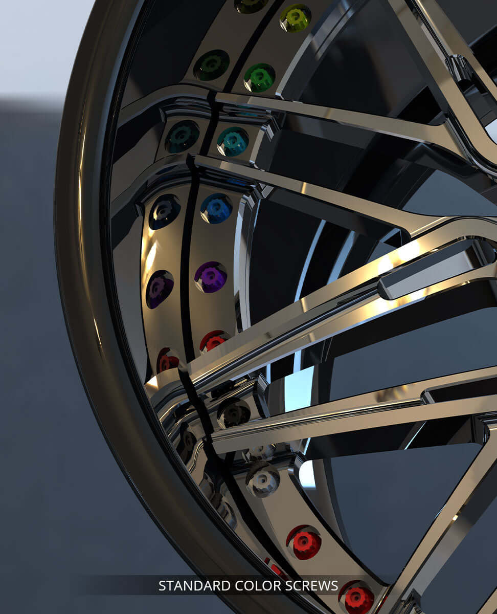
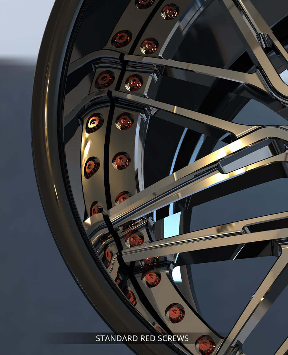
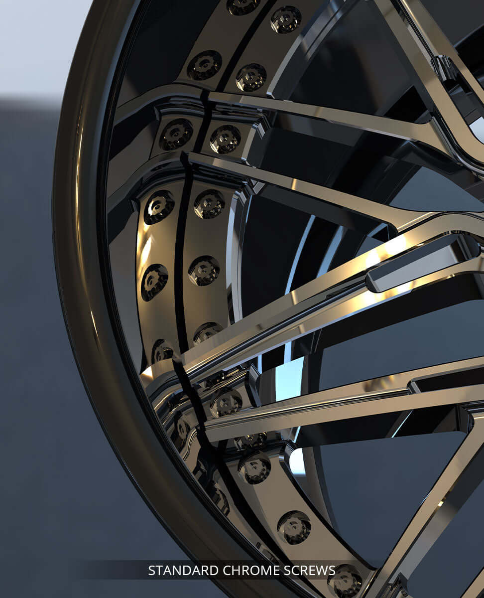
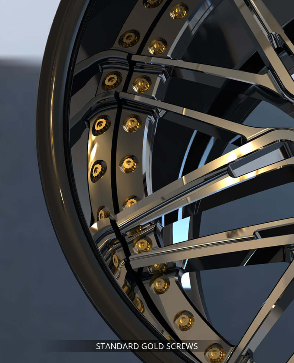
Hardware Color
(required)
(Please select the color of the wheel screws)
— This option may appear depending on other selections.
-
Black
-
Chrome
-
Red
-
Burnt Titanium Finish+150
-
Grade 5 Titanium+300
-
…and 7 more
-
Choose your finish style
(optional)
— This option may appear depending on other selections.
-
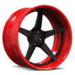
Single Finish
-
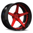
2-Tone Finish+50
-
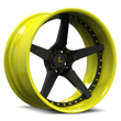
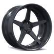
Carbon Fiber
-
Choose your finish style
(optional)
— This option may appear depending on other selections.
-
Single Finish
-
2-Tone Finish+50
-
3-Tone Finish+75
-
Carbon Fiber
-
Carbon Fiber Series
(required)
— This option may appear depending on other selections.
-
Carbon Fiber Wrapped Lip & Spoke+725
-
Hydro-Dipped Carbon Fiber Lip & Spoke+500
-
Carbon Fiber Series
(required)
— This option may appear depending on other selections.
-
Carbon Fiber Wrapped Spoke+675
-
Carbon Fiber Wrapped Barrel+675
-
Carbon Fiber Wrapped Lip+475
-
Fully Carbon Fiber Wrapped (Spoke + Barrel + Lip)+1300
-
Hydro-Dipped Carbon Fiber Lip & Spoke+500
-
…and 2 more
-
Carbon Fiber Options
(optional)
— {{total}} Available
— This option may appear depending on other selections.
-
CF01 Classic 2x2 Twill Carbon Fiber
-
CF02 Red 2x2 Twill Carbon Fiber+200
-
CF03 Forged Carbon Fiber+125
-
CF04 Honey Comb Carbon Fiber
-
Single Finish Options
(required)
-
Splux Standard Solid / Transparent Color
-
Custom Color Required+100
-
All Chrome+200
-
Primary Finish Options
(required)
-
Splux Standard Solid / Transparent Color
-
Custom Color Required+100
-
2-Tone Finish Options
(required)
— Select a total of 2 finishes for your 2-Tone Finish. You can mix and match from the categories below.
-
Splux Standard Solid / Transparent Color
-
Custom Color Required+100
-
2-Tone Finish Options
(required)
— Select a total of 2 finishes for your 2-Tone Finish. You can mix and match from the categories below.
-
Splux Standard Solid / Transparent Color
-
Custom Color Required+100
-
Chrome Barrel / Spoke+100
-
3-Tone Finish Options
(required)
— Select a total of 3 finishes for your 3-Tone Finish. You can mix and match from the categories below.
-
Splux Standard Solid / Transparent Color
-
Custom Color Required+100
-
Chrome Barrel / Spoke+100
-
Finish Notes & Custom Requests
(optional)
— Please describe your desired wheel finish or any specific ideas you have in mind. Our team will provide a custom rendering for your confirmation if the requested finish is feasible.
(e.g., "I want piano black spokes and gloss red barrel...")
Define Size & Fitment
Define Size & Fitment
Front Wheel Size (Qty: 2)
-
Wheel Position
(required)
-
Diameter (Inch)
(required)
-
17
-
18+100
-
19+125
-
20+150
-
21+175
-
…and 4 more
-
Width (Inch)
(required)
-
7
-
7.5
-
8
-
8.5
-
9
-
…and 10 more
Rear Wheel Size (Qty: 2)
-
Wheel Position
(required)
-
Diameter (Inch)
(required)
-
17
-
18+100
-
19+125
-
20+150
-
21+175
-
…and 4 more
-
Width (Inch)
(required)
-
7
-
7.5
-
8
-
8.5
-
9
-
…and 10 more
Wheel Size (Qty: 1)
-
Wheel Position
(required)
-
Front (Staggered)
-
Rear (Staggered)
-
Same Size Front & Rear
-
Diameter (Inch)
(required)
-
16
-
17
-
18+50
-
19+62.5
-
20+75
-
…and 5 more
-
Width (Inch)
(required)
-
7
-
7.5
-
8
-
8.5
-
9
-
…and 10 more
-
Optional Upgrade: Enhanced Concave Profile
(optional)
— For those seeking a more aggressive concave look on their one-piece forged wheels, we offer an upgraded machining option. To achieve this enhanced visual depth, we use a different grade of forged blank with adjusted dimensions — typically thicker or larger in diameter — to accommodate deeper cuts without compromising structural integrity. This special material selection and reprogramming process adds complexity to production, which is reflected in the $200 surcharge.
— This option may appear depending on other selections.
-
I want more concave look +200
Customize Center Caps & Engraving
Define Size & Fitment
Define Size & Fitment
Wheel Size (Qty: 1)
-
Wheel Position
(required)
-
Front (Staggered)
-
Rear (Staggered)
-
Same Size Front & Rear
-
Diameter (Inch)
(required)
-
17
-
18+50
-
19+62.5
-
20+75
-
21+87.5
-
…and 4 more
-
Width (Inch)
(required)
-
7
-
7.5
-
8
-
8.5
-
9
-
…and 10 more
-
Mounting System (Multi-Lug or Center-Lock)
(required)
-
Factory bolt pattern
-
Bolt pattern conversion / adapters
-
Center Lock+800
-
Wheel PCD, CB, Offset (100% Fitment Guarantee)
(optional)
— Verified by Splux engineers for a perfect fit.
-
Splux engineers research & confirm
-
Provide your own specs, verified by Splux engineers
-
Wheel Offset (100% Fitment Guarantee)
(required)
— Verified by Splux engineers for a perfect fit.
-
Splux engineers research & confirm
-
Provide your own specs, verified by Splux engineers
-
Desired Fitment Style
(required)
— For all fitment styles excluding Inside Fender, achieving the ideal stance requires precise measurement. The Splux engineering team will personally guide you through a few simple steps to ensure perfect fitment and visual balance.
-
Inside Fender
-
Flush Wheel Fitment
-
Tucked Wheel Fitment
-
Slight Poke
-
Poke Wheel Fitment
-
…and 1 more
-
Optional Upgrade: Enhanced Concave Profile
(optional)
— For those seeking a more aggressive concave look on their one-piece forged wheels, we offer an upgraded machining option. To achieve this enhanced visual depth, we use a different grade of forged blank with adjusted dimensions — typically thicker or larger in diameter — to accommodate deeper cuts without compromising structural integrity. This special material selection and reprogramming process adds complexity to production, which is reflected in the $200 surcharge.
— This option may appear depending on other selections.
-
I want more concave look +50
-
Optional Upgrade: Enhanced Concave Profile
(optional)
— For those seeking a more aggressive concave look on their one-piece forged wheels, we offer an upgraded machining option. To achieve this enhanced visual depth, we use a different grade of forged blank with adjusted dimensions — typically thicker or larger in diameter — to accommodate deeper cuts without compromising structural integrity. This special material selection and reprogramming process adds complexity to production, which is reflected in the $200 surcharge.
— This option may appear depending on other selections.
-
I want more concave look +50
Customize Center Caps & Engraving
-
Mounting System (Multi-Lug or Center-Lock)
(required)
-
Factory bolt pattern
-
Bolt pattern conversion / adapters
-
Center Lock+800
-
Wheel PCD, CB, Offset (100% Fitment Guarantee)
(optional)
— Verified by Splux engineers for a perfect fit.
-
Splux engineers research & confirm
-
Provide your own specs, verified by Splux engineers
-
Wheel Offset (100% Fitment Guarantee)
(required)
— Verified by Splux engineers for a perfect fit.
-
Splux engineers research & confirm
-
Provide your own specs, verified by Splux engineers
-
Desired Fitment Style
(required)
— For all fitment styles excluding Inside Fender, achieving the ideal stance requires precise measurement. The Splux engineering team will personally guide you through a few simple steps to ensure perfect fitment and visual balance.
-
Inside Fender
-
Flush Wheel Fitment
-
Tucked Wheel Fitment
-
Slight Poke
-
Poke Wheel Fitment
-
…and 1 more
-
Mounting System (Multi-Lug or Center-Lock)
(required)
-
Factory bolt pattern
-
Bolt pattern conversion / adapters
-
Center Lock+800
-
Wheel PCD, CB, Offset (100% Fitment Guarantee)
(optional)
— Verified by Splux engineers for a perfect fit.
-
Splux engineers research & confirm
-
Provide your own specs, verified by Splux engineers
-
Wheel Offset (100% Fitment Guarantee)
(required)
— Verified by Splux engineers for a perfect fit.
-
Splux engineers research & confirm
-
Provide your own specs, verified by Splux engineers
-
Desired Fitment Style
(required)
— For all fitment styles excluding Inside Fender, achieving the ideal stance requires precise measurement. The Splux engineering team will personally guide you through a few simple steps to ensure perfect fitment and visual balance.
-
Inside Fender
-
Flush Wheel Fitment
-
Tucked Wheel Fitment
-
Slight Poke
-
Poke Wheel Fitment
-
…and 1 more
-
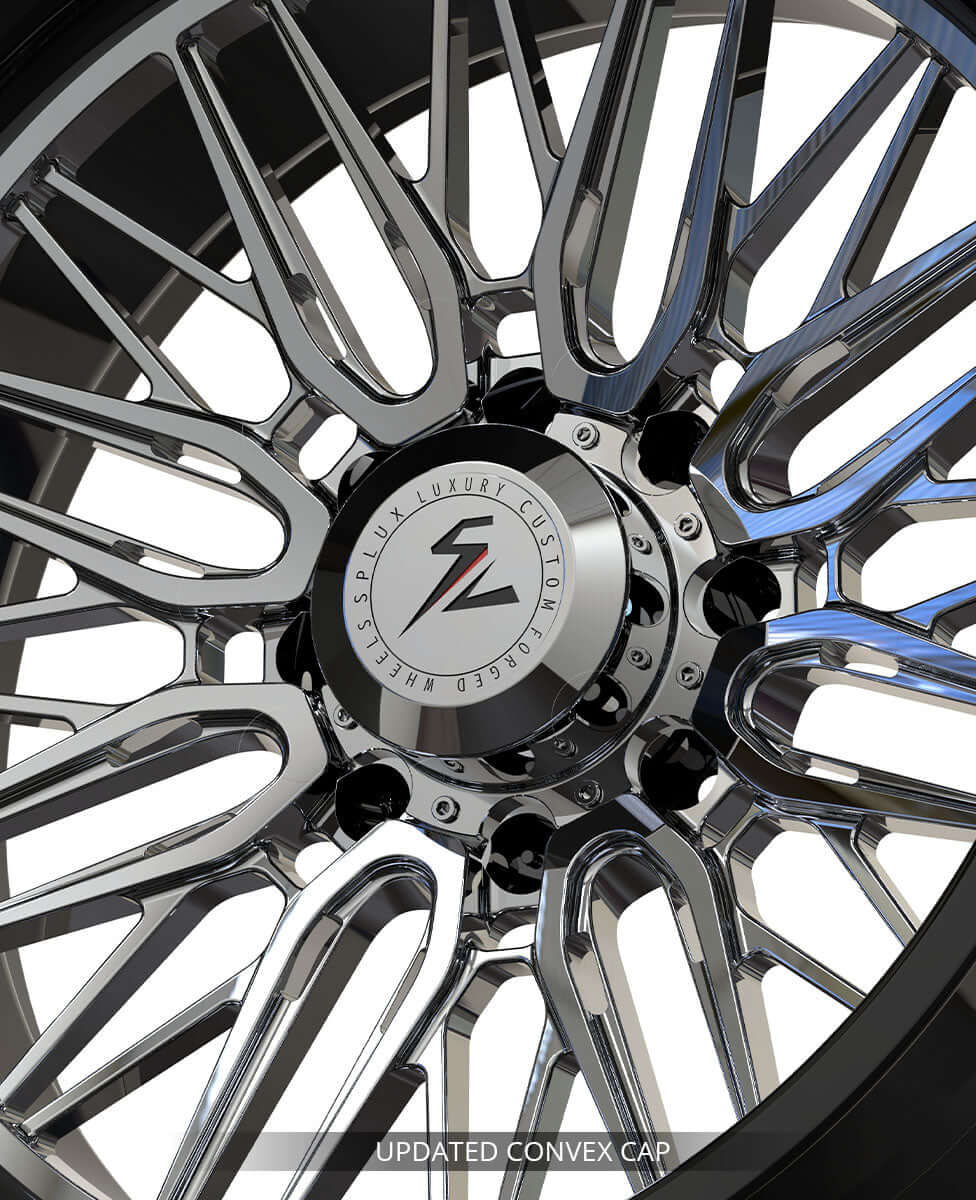
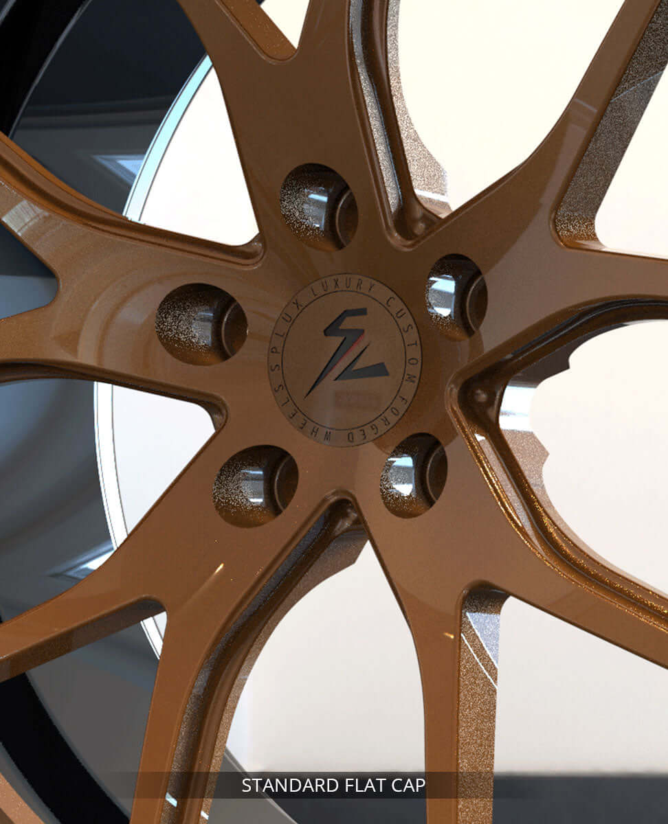
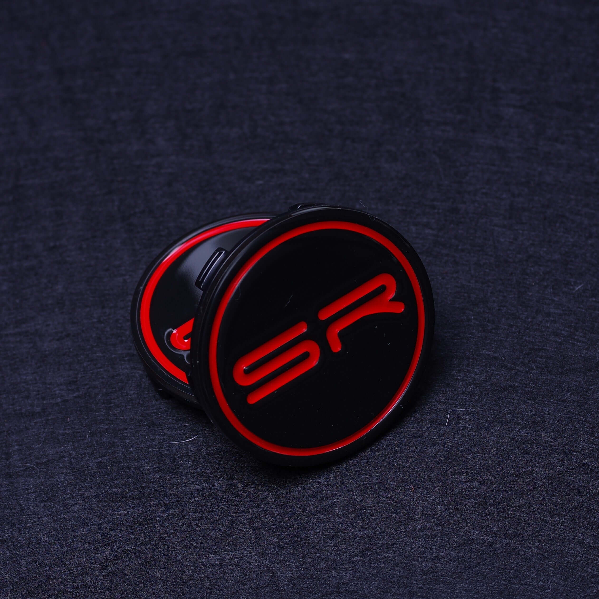
Center Cap Style
(required)
— {{total}} Available
(Please select your center caps)
-
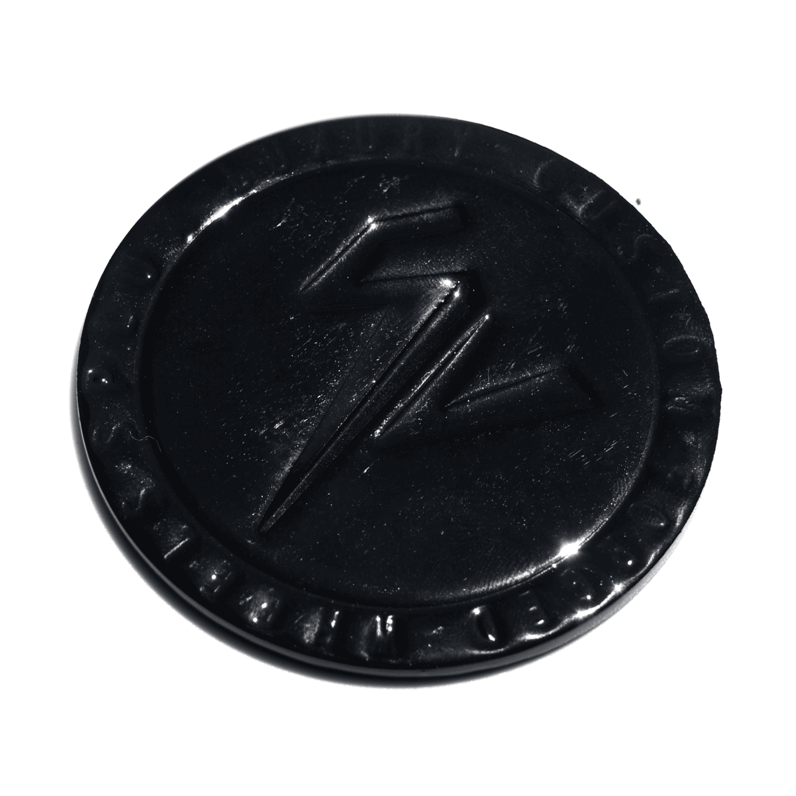
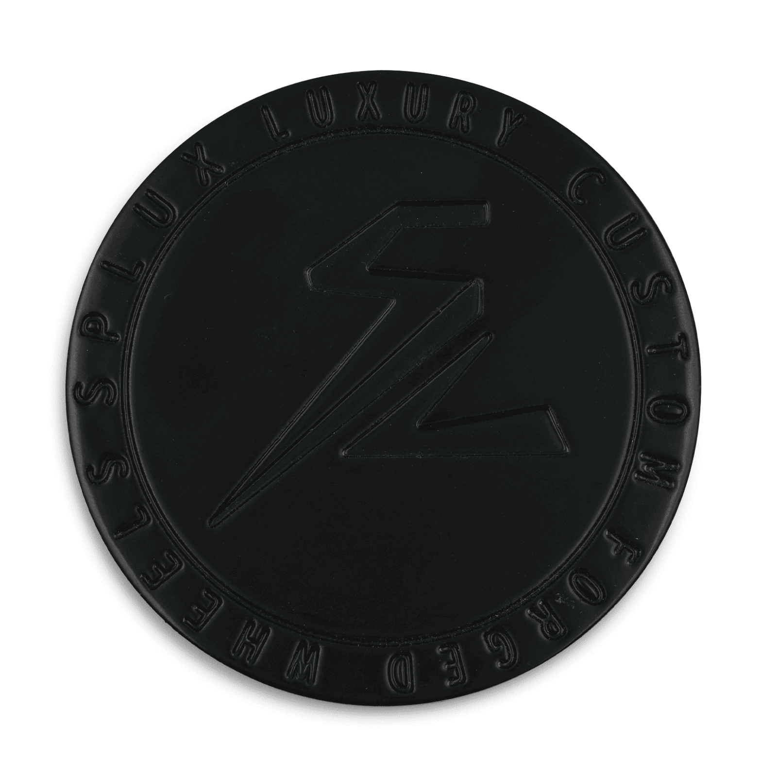
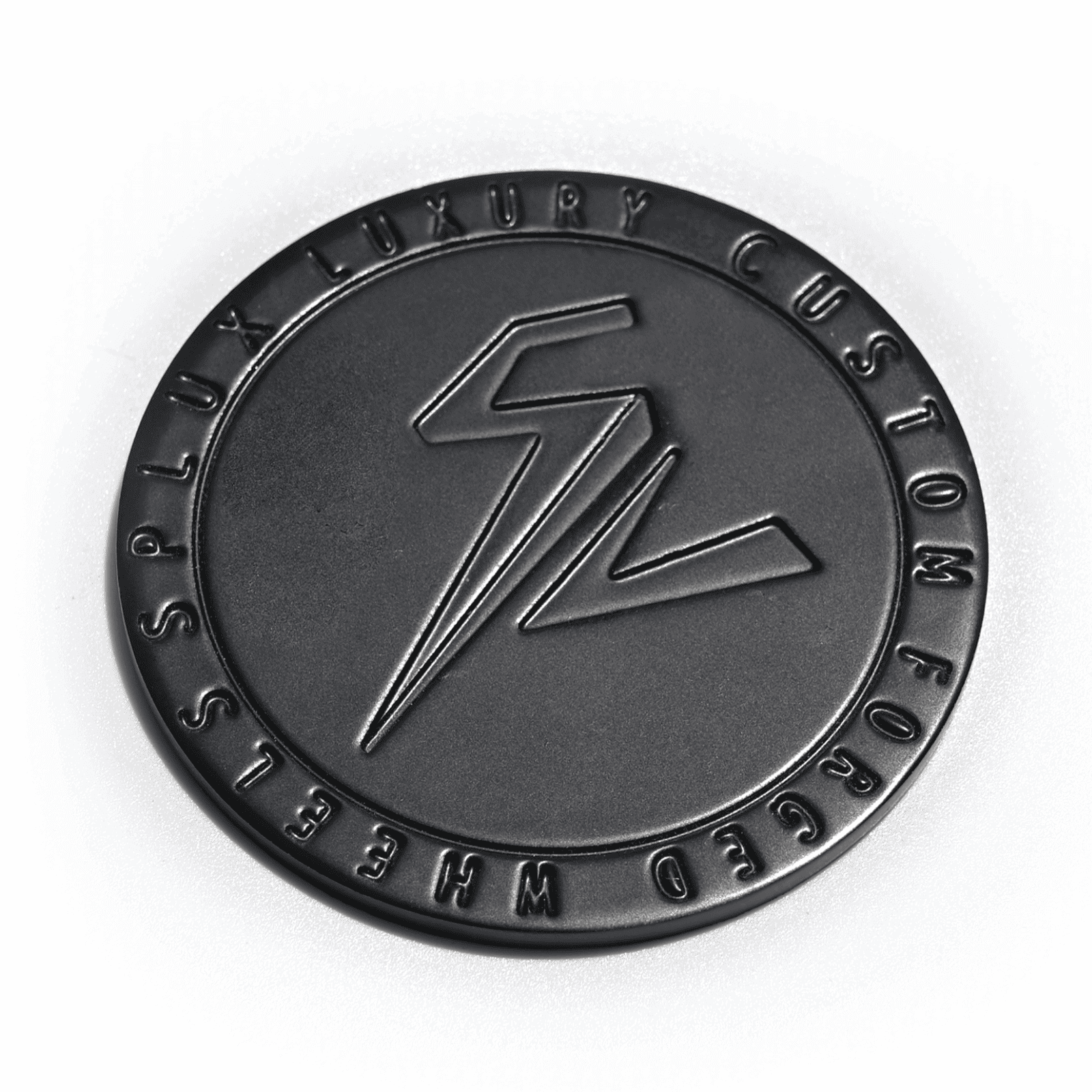
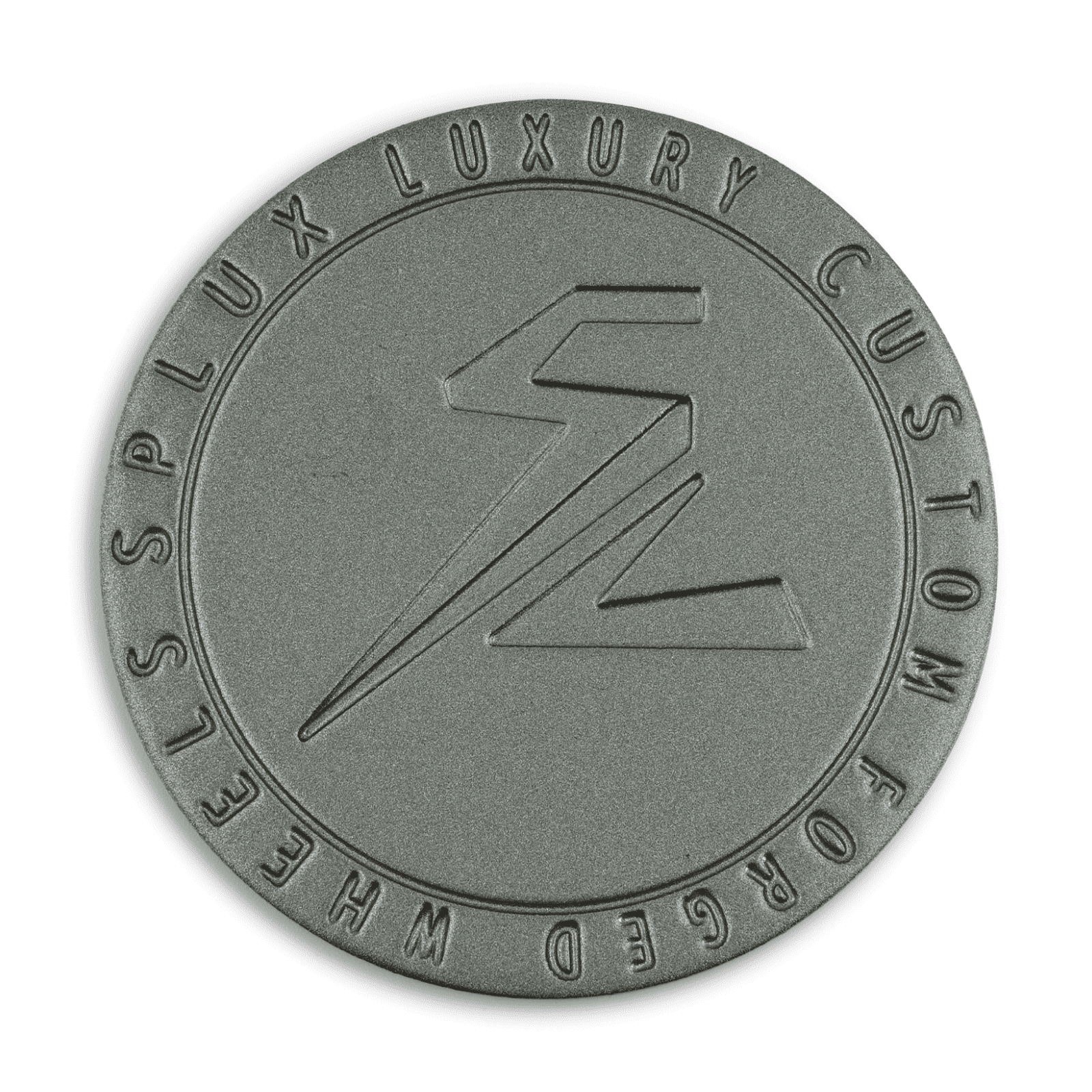
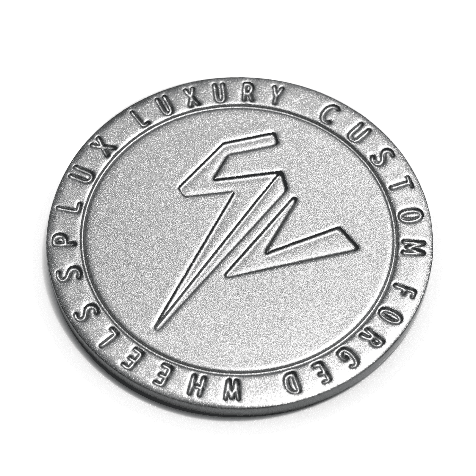
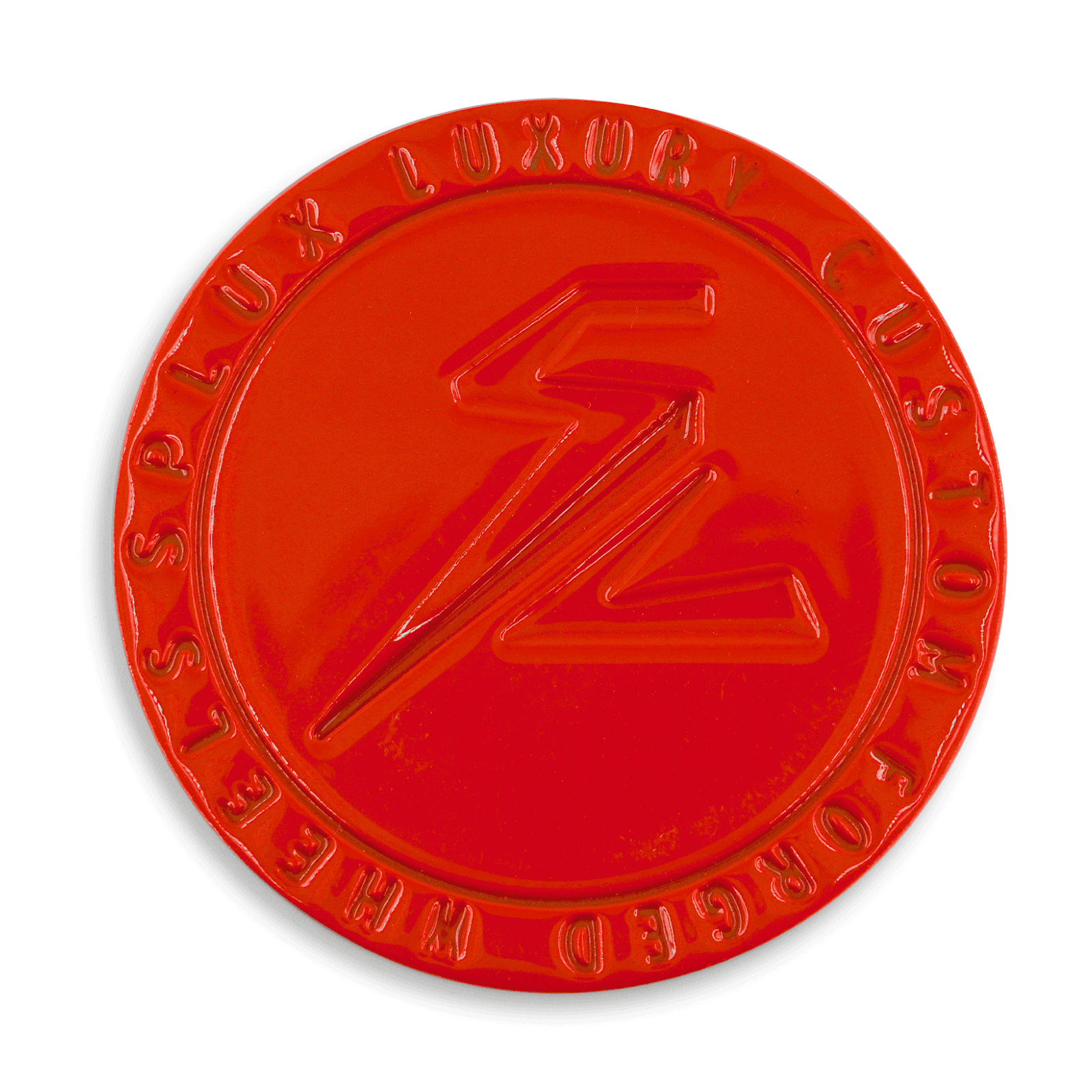
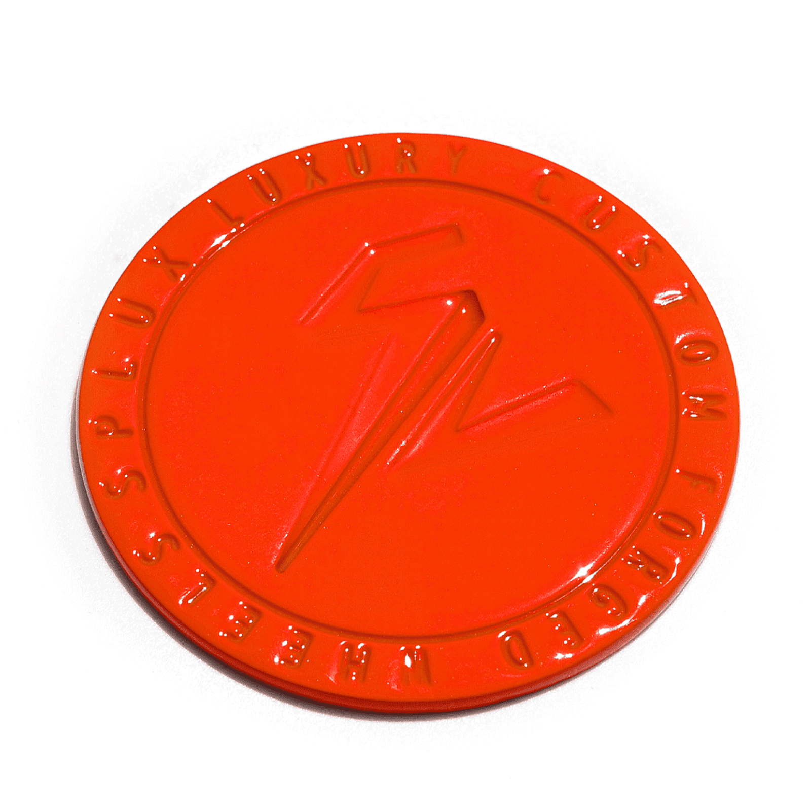
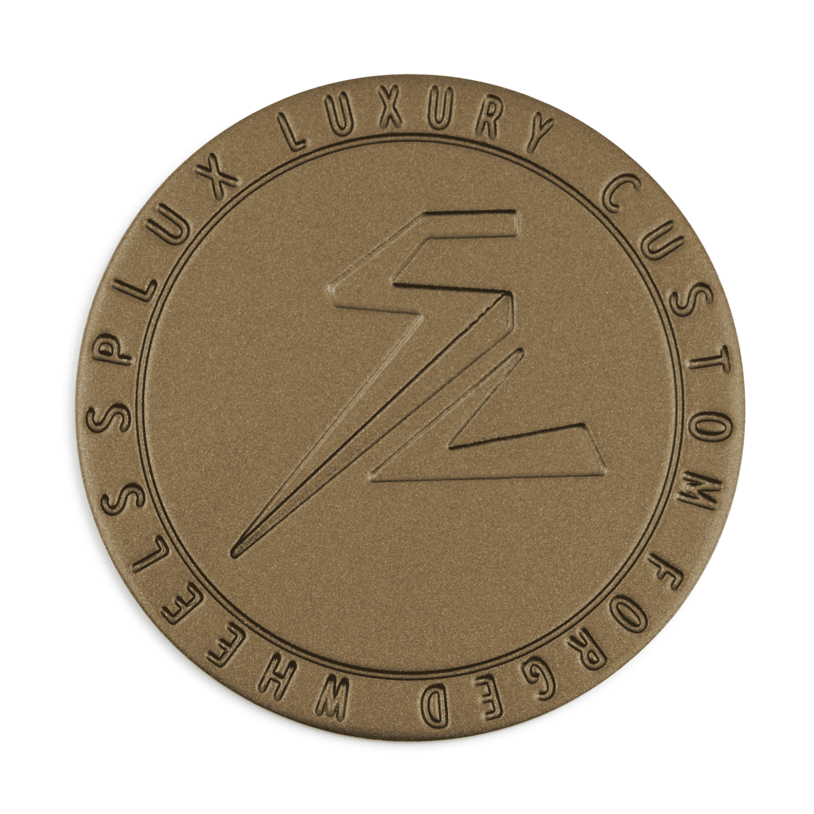
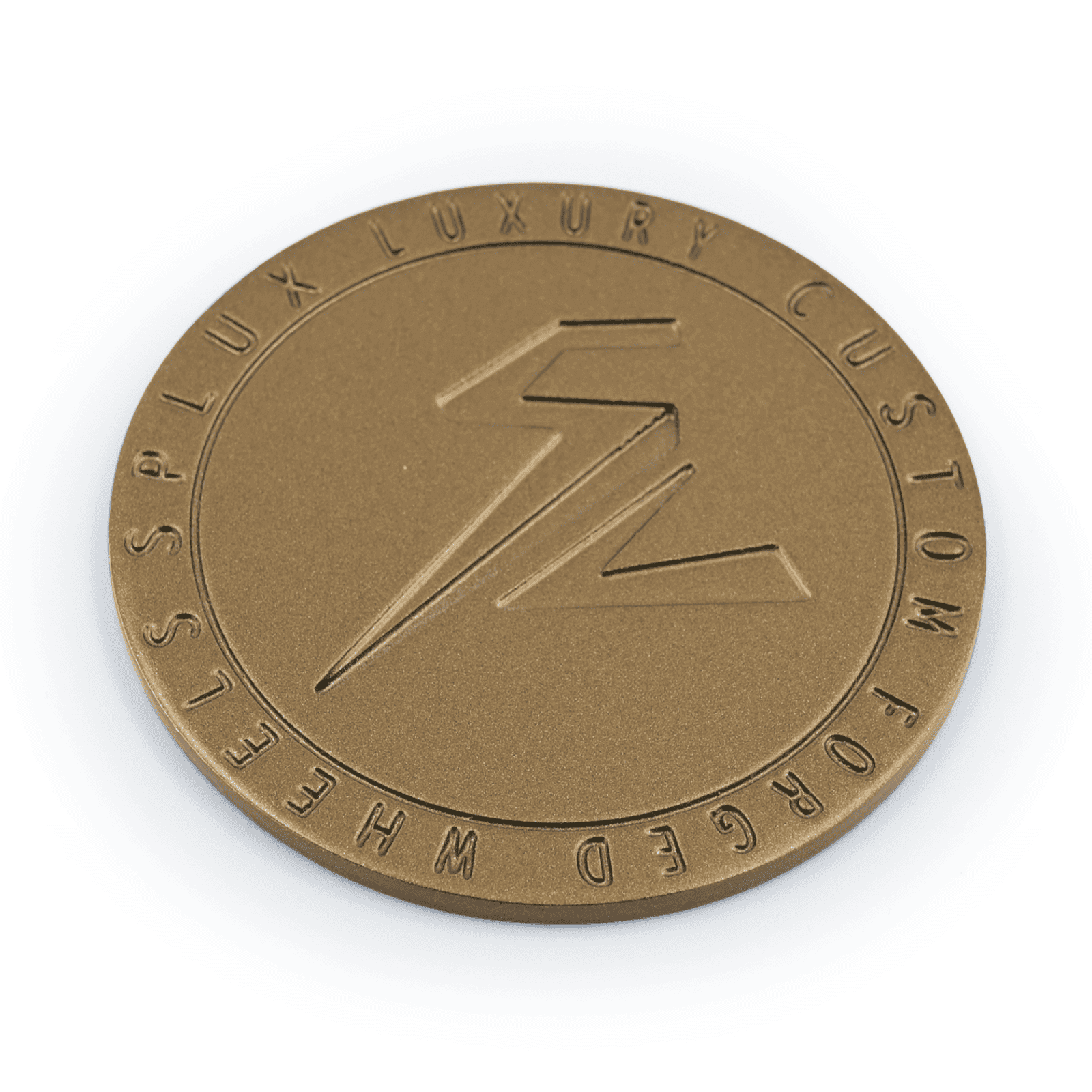
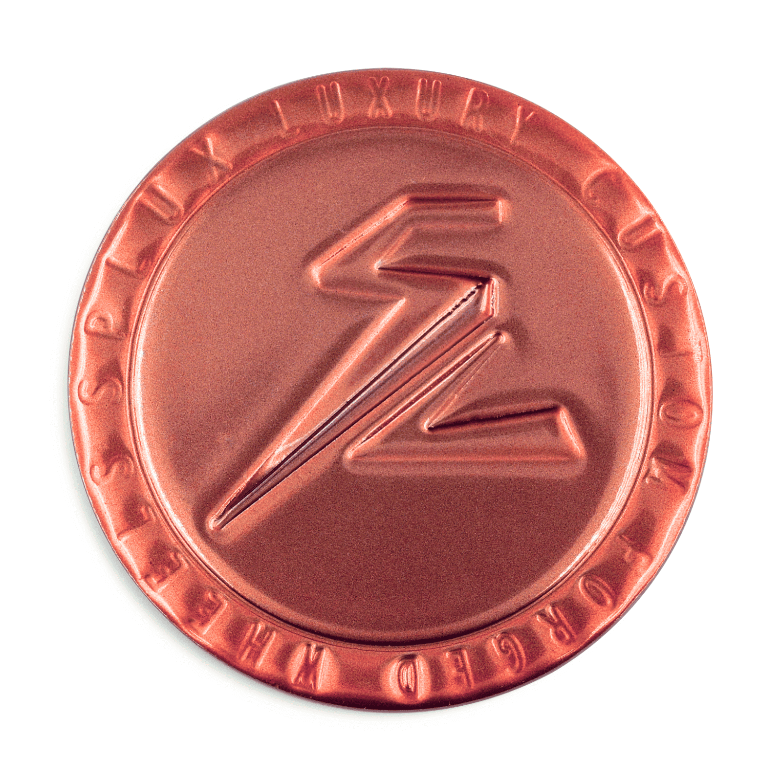
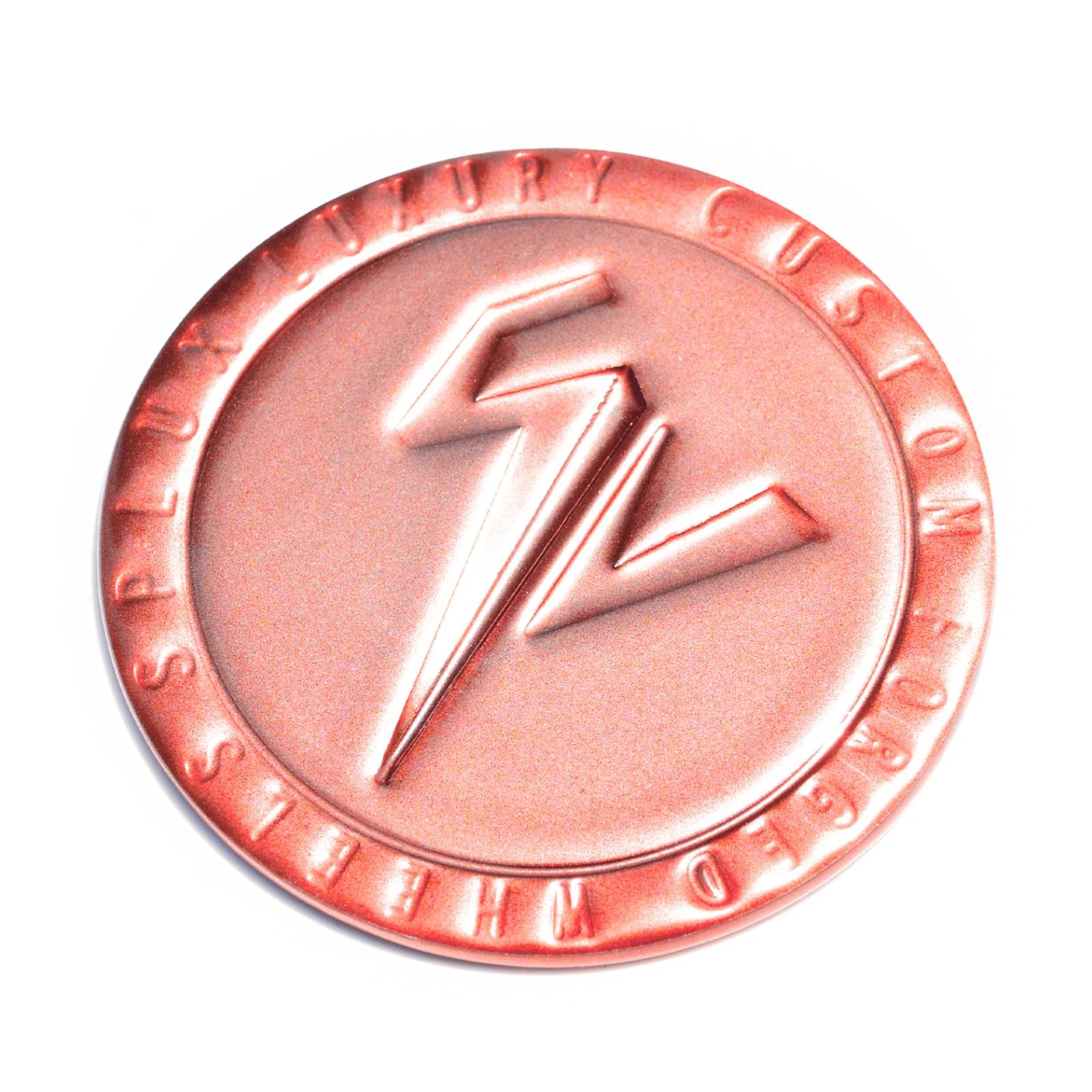
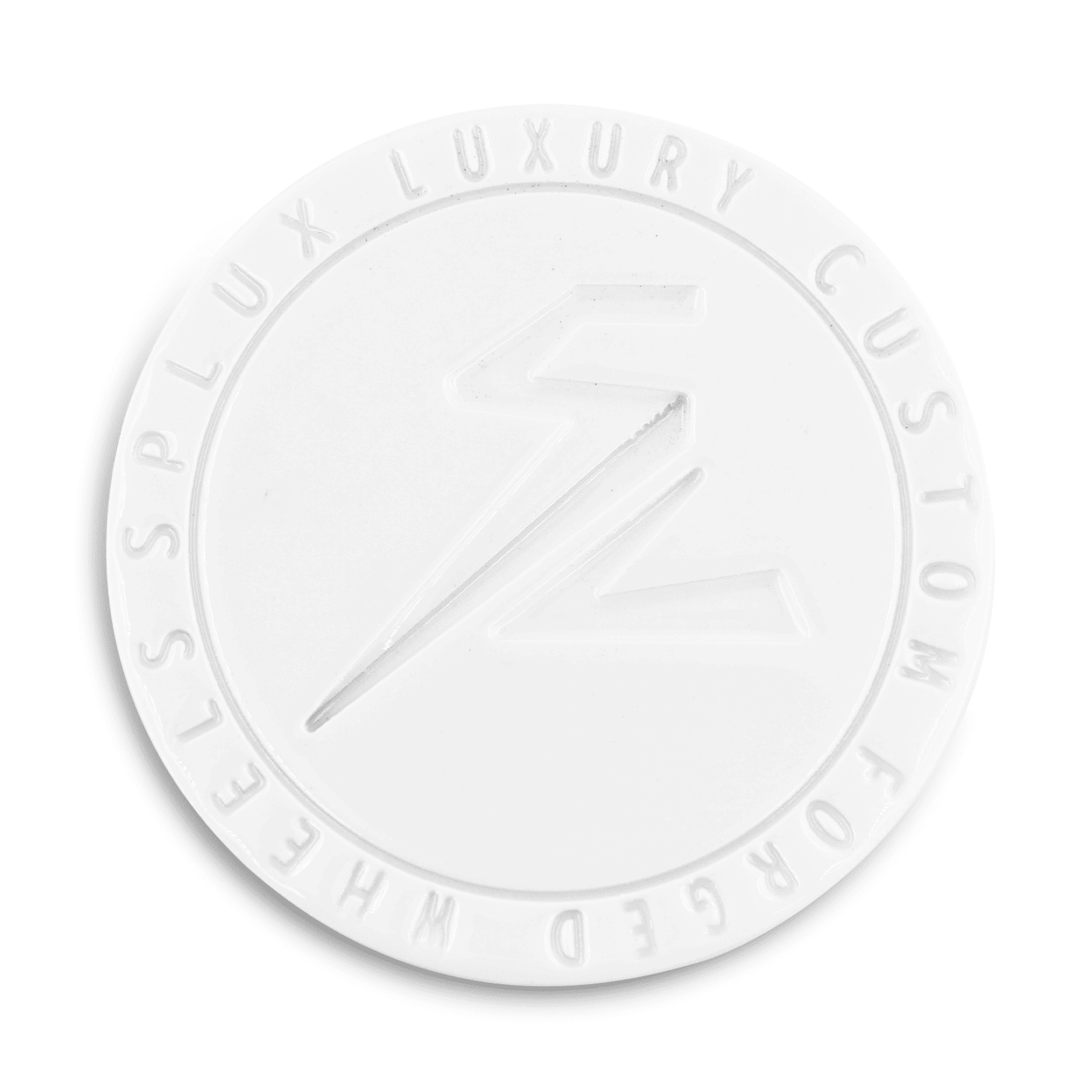
Standard Flat Center Caps - Quantity: 1
-
2/3-Blade Center Caps - Quantity: 1+150
-
Carbon Fiber Wrapped Center Caps - Quantity: 1+200
-
Center-Lock Style Caps - Quantity: 1+200
-
Floating Center Caps - Quantity: 1+150
-
…and 3 more
-
Center Cap Emblem Design
(required)
(Please select your emblem)
— This option may appear depending on other selections.
-
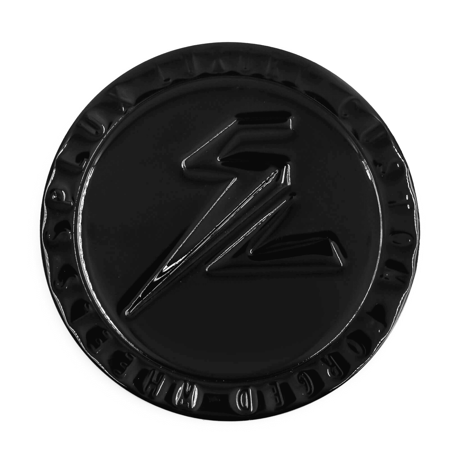
Defaut Splux Logo
-
Your Ride's Emblem+50
-
Your Own Design+50
-
Your Own Design
(required)
-
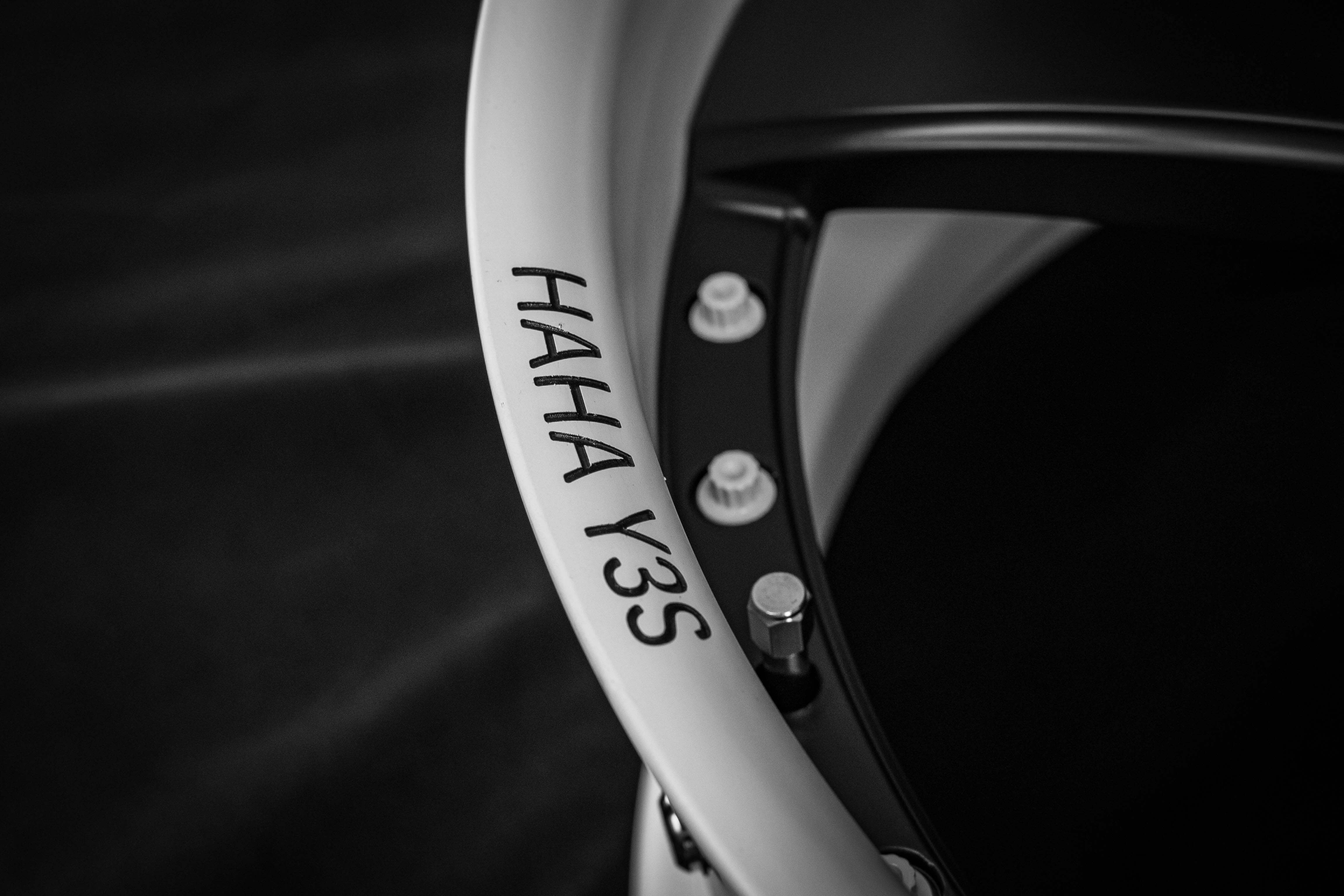
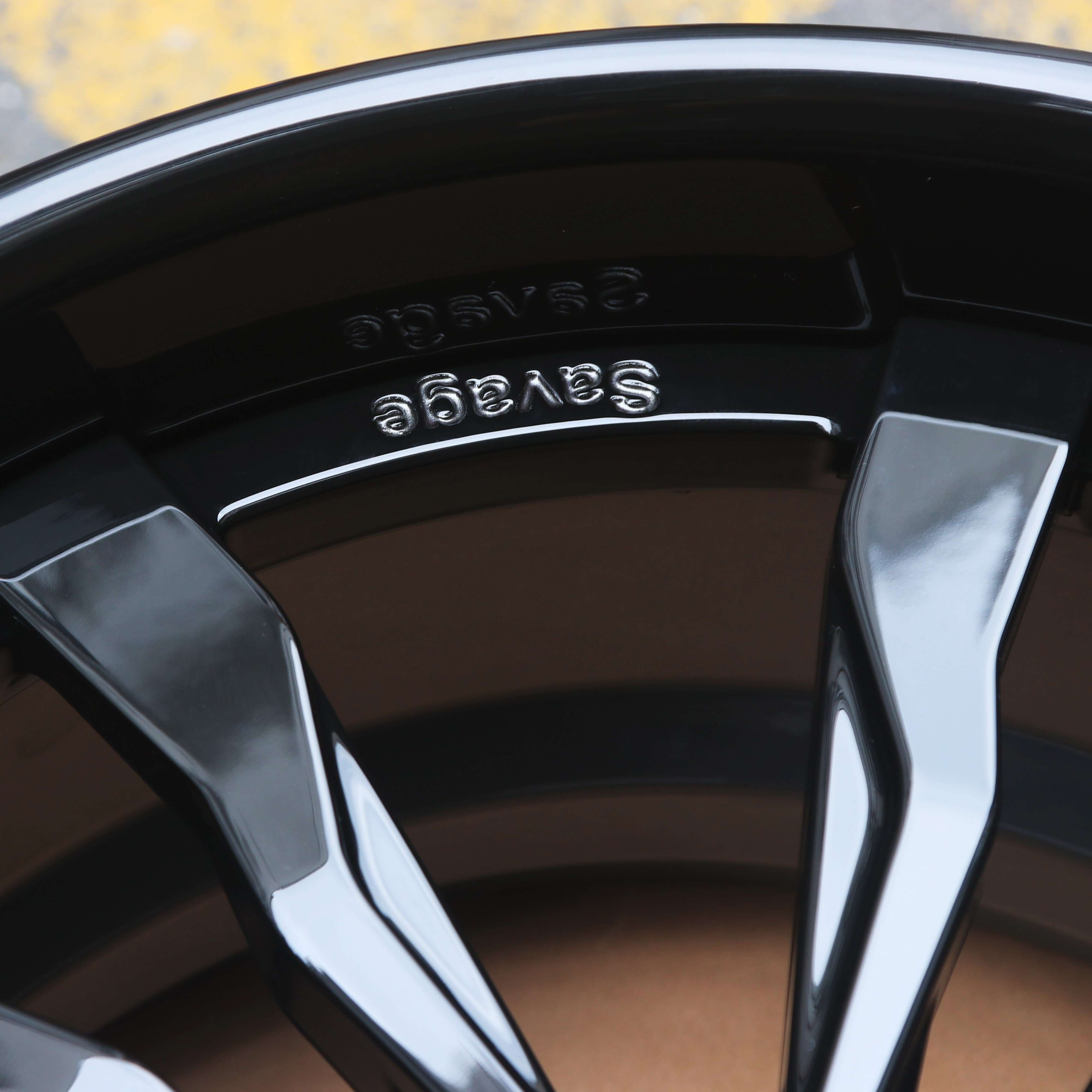
Engraving
(optional)
+25
(Default "SPLUX FORGED")
-
Font picker
(optional)
— This option may appear depending on other selections.
-
Open Sans
-
Brush Script
-
SPLUX SCRIPT
Front Wheel Size (Qty: 2)
-
Wheel Position
(required)
-
Diameter (Inch)
(required)
-
16
-
17
-
18+100
-
19+125
-
20+150
-
…and 5 more
-
Width (Inch)
(required)
-
7
-
7.5
-
8
-
8.5
-
9
-
…and 10 more
Rear Wheel Size (Qty: 2)
-
Wheel Position
(required)
-
Diameter (Inch)
(required)
-
16
-
17
-
18+100
-
19+125
-
20+150
-
…and 5 more
-
Width (Inch)
(required)
-
7
-
7.5
-
8
-
8.5
-
9
-
…and 10 more
-
Wheel Position
(required)
-
Front (Staggered)
-
Rear (Staggered)
-
Same Size Front & Rear
-
Real Carbon Fiber Series Wheel Size
(required)
-
20" X 8.5J
-
20" X 9J+400
-
20" X 9.5J+800
-
20" X 10J+1200
-
20" X 10.5J+1600
-
…and 15 more
-
Wheel Position
(required)
-
Front (Staggered)
-
Rear (Staggered)
-
Same Size Front & Rear
-
Real Carbon Fiber Series Wheel Size
(required)
-
20" X 8.5J
-
20" X 9J+400
-
20" X 9.5J+800
-
20" X 10J+1200
-
20" X 10.5J+1600
-
…and 15 more
-
Mounting System (Multi-Lug or Center-Lock)
(required)
-
Factory bolt pattern
-
Bolt pattern conversion / adapters
-
Center Lock+800
-
Wheel PCD, CB, Offset (100% Fitment Guarantee)
(optional)
— Verified by Splux engineers for a perfect fit.
— This option may appear depending on other selections.
-
Splux engineers research & confirm
-
Provide your own specs, verified by Splux engineers
-
Wheel Offset (100% Fitment Guarantee)
(required)
— Verified by Splux engineers for a perfect fit.
— This option may appear depending on other selections.
-
Splux engineers research & confirm
-
Provide your own specs, verified by Splux engineers
-
Desired Fitment Style
(required)
— For all fitment styles excluding Inside Fender, achieving the ideal stance requires precise measurement. The Splux engineering team will personally guide you through a few simple steps to ensure perfect fitment and visual balance.
-
Inside Fender
-
Flush Wheel Fitment
-
Tucked Wheel Fitment
-
Slight Poke
-
Poke Wheel Fitment
-
…and 1 more
-
Hardware Color
(required)
(Please select the color of the wheel screws)
— This option may appear depending on other selections.
-
Black
-
Chrome
-
Red
-
Burnt Titanium Finish+600
-
Grade 5 Titanium+1200
-
…and 7 more
-
Choose your finish style
(optional)
— This option may appear depending on other selections.
-
Single Finish
-
2-Tone Finish+200
-
Carbon Fiber
-
Choose your finish style
(optional)
— This option may appear depending on other selections.
-
Single Finish
-
2-Tone Finish+200
-
3-Tone Finish+300
-
Carbon Fiber
-
Carbon Fiber Series
(required)
— This option may appear depending on other selections.
-
Carbon Fiber Wrapped Lip & Spoke+2900
-
Hydro-Dipped Carbon Fiber Lip & Spoke+2000
-
Carbon Fiber Series
(required)
— This option may appear depending on other selections.
-
Carbon Fiber Wrapped Spoke+2700
-
Carbon Fiber Wrapped Barrel+2700
-
Carbon Fiber Wrapped Lip+1900
-
Fully Carbon Fiber Wrapped (Spoke + Barrel + Lip)+5200
-
Hydro-Dipped Carbon Fiber Lip & Spoke+2000
-
…and 2 more
-
Single Finish Options
(required)
— This option may appear depending on other selections.
-
Splux Standard Solid / Transparent Color
-
Custom Color Required+400
-
All Chrome+800
-
Carbon Fiber Options
(optional)
— {{total}} Available
— This option may appear depending on other selections.
-
CF01 Classic 2x2 Twill Carbon Fiber
-
CF02 Red 2x2 Twill Carbon Fiber+800
-
CF03 Forged Carbon Fiber+500
-
CF04 Honey Comb Carbon Fiber
-
Primary Finish Options
(required)
— This option may appear depending on other selections.
-
Splux Standard Solid / Transparent Color
-
Custom Color Required+400
-
2-Tone Finish Options
(required)
— Select a total of 2 finishes for your 2-Tone Finish. You can mix and match from the categories below.
— This option may appear depending on other selections.
-
Splux Standard Solid / Transparent Color
-
Custom Color Required+400
-
2-Tone Finish Options
(required)
— Select a total of 2 finishes for your 2-Tone Finish. You can mix and match from the categories below.
— This option may appear depending on other selections.
-
Splux Standard Solid / Transparent Color
-
Custom Color Required+400
-
Chrome Barrel / Spoke+400
-
3-Tone Finish Options
(required)
— Select a total of 3 finishes for your 3-Tone Finish. You can mix and match from the categories below.
— This option may appear depending on other selections.
-
Splux Standard Solid / Transparent Color
-
Custom Color Required+400
-
Chrome Barrel / Spoke+400
-
Finish Notes & Custom Requests
(optional)
— Please describe your desired wheel finish or any specific ideas you have in mind. Our team will provide a custom rendering for your confirmation if the requested finish is feasible.
(e.g., "I want piano black spokes and gloss red barrel...")
-
Center Cap Style
(required)
— {{total}} Available
(Please select your center caps)
— This option may appear depending on other selections.
-
Standard Flat Center Caps - Quantity: 4
-
2/3-Blade Center Caps - Quantity: 4+600
-
Carbon Fiber Wrapped Center Caps - Quantity: 4+800
-
Center-Lock Style Caps - Quantity: 4+800
-
Floating Center Caps - Quantity: 4+600
-
…and 3 more
-
Center Cap Emblem Design
(required)
(Please select your emblem)
— This option may appear depending on other selections.
-
Defaut Splux Logo
-
Your Ride's Emblem+200
-
Your Own Design+200
-
Your Own Design
(required)
— This option may appear depending on other selections.
-
Engraving
(optional)
+100
(Default "SPLUX FORGED")
-
Year / Make / Model
(required)
(Enter your vehicle's year, make, and model)
-
Current Ride Height
(required)
-
Stock height
-
Lowered (springs / coilovers)
-
Air suspension
-
Lifted
-
Brakes/ Calipers
(required)
-
Factory OEM brakes
-
OEM Carbon Ceramic
-
Upgraded Aftermarket Big Brake Kit
-
Fender / Body Setup
(required)
-
Stock body
-
Widebody kit
-
Rolled fenders
-
Pulled fenders
-
Remarks
(optional)
(You can write any special requests or additional notes here. Our team will review and confirm all details before production.)
Confirm Vehicle Details
-
🎁 Bonus Gift — Limited Time Only!
(optional)
-
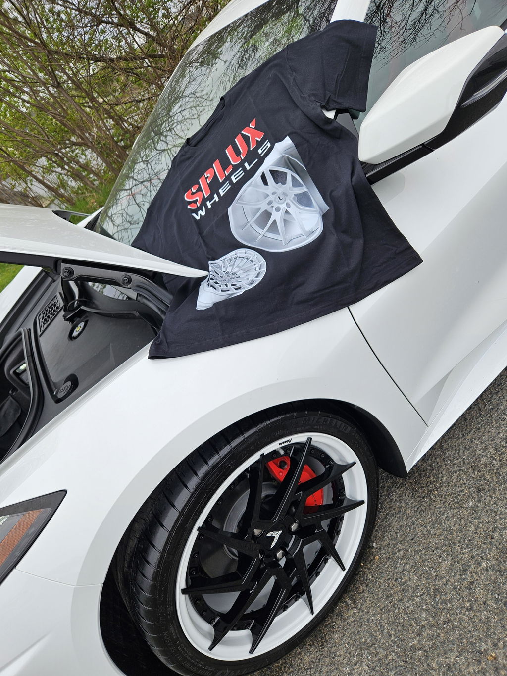
Splux T-Shirt($30 value)
-
Splux Baseball cap($30 value)
-
Wheel Display Add-Ons
(optional)
-
Splux Standard Wheel Display Holder+100
-
Splux Carbon Fiber Style Wheel Display Holder+200
-
Font picker
(optional)
— This option may appear depending on other selections.
-
Open Sans
-
Brush Script
-
SPLUX SCRIPT